BLENDING COPIC COLORS TUTORIAL
Blending colors is a wonderful way to get the shades you want, if you do not have all of the colors. When I first started with Copics, I started with a few basic colors. First of all because I could not afford them all at once, second of all, I was not completely sold on them! Once I played with them and discovered the awesome blending possibilities, I was quickly sold on these fabulous markers!
Blending colors is a wonderful way to get the shades you want, if you do not have all of the colors. When I first started with Copics, I started with a few basic colors. First of all because I could not afford them all at once, second of all, I was not completely sold on them! Once I played with them and discovered the awesome blending possibilities, I was quickly sold on these fabulous markers!
Ok, for those of you who know about the basics of coloring, please bear with me as I just go all the way to the beginning of Color! J I am going to assume you know nothing, although I am quite confident you DO know these things.
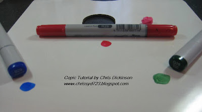
What you will need
A few basic colors of Copics
Palette for blending colors – you could use a plastic plate or the clear storage container you have for your Copics.
First, we will build a basic Color Pallette, creating our own Color Wheel….
What you will need
A few basic colors of Copics
Palette for blending colors – you could use a plastic plate or the clear storage container you have for your Copics.
First, we will build a basic Color Pallette, creating our own Color Wheel….
Your three PRIMARY colors will be the root of all of your colors…In elementary school, you may have learned that the primary colors are red, yellow, and blue. However, most of us now use color displays, for which the primary colors will be red, green, and blue.
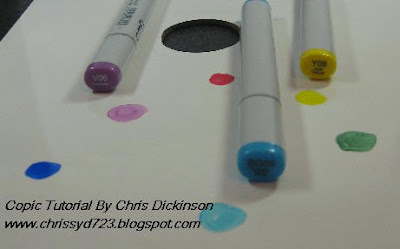
These are the Secondary Colors – you have Yellow, Purple and turquoise…
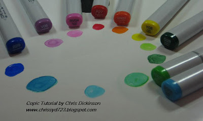 You can blend any of those Primary and Secondary Colors to get varying TERTIARY colors. Going one step further, you can add to the GRAY SCALE of the Copic line to get the depth of color you are looking for. (Remember the second number in the Copic Code tells you the amount of GRAY PIGMENT in your marker.) This will help you if you do not have the colors you are looking for in your personal marker selection to get the exact shades you want in your coloring.
For example:
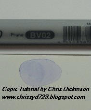
We will take the BG05 marker and color your palette. Once you get really comfortable mixing your own colors, you can even eliminate this step and color directly on your cardstock.
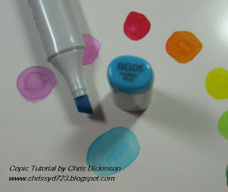
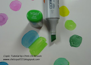
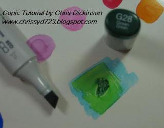
Drawing on top or next to the BG05, use YG07 (or other colors of your choosing) then take the darker pigment, in this case, I used G28… using less of the darker pigment than the lighter colors (remember there is more color pigment and gray in this for a darker color, so you need less) and blend with your Colorless Blender or any of the Copic Markers you are using. I used the Colorless blender so I can then tell when the color I mixed run out.
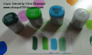
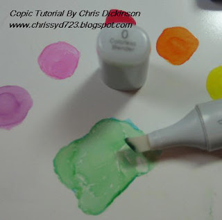
In the final image with the varying colors, you can see the mixed color drawn on the cardstock with the Colorless Blender. I put the covers for your viewing to see the colors I chose to mix.
I apologize for some of the blurry images on this next segment…
On last weeks Tutorial, I mentioned Tip to Tip coloring…
For this technique, you will need two Copic markers -


For easier visuals, so you can see the difference in the tips, I chose Y13 and R27. Color directly on the tips – you can use the brush tip or Chisel tip depending on what you want. I used the Chisel tip so you can see where the color is.
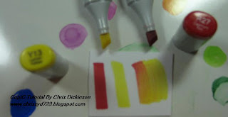
With Tip to Tip Coloring and any blending method, you will need to replenish your Coloring marker with the other color often. In the photograph, you can see the yellow markers return to their original color once the red color is used up off of the yellow tip.
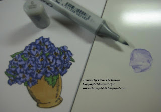
Now that you have the basics, here is a stamped image being colored using the same techniques mentioned above in blending colors.
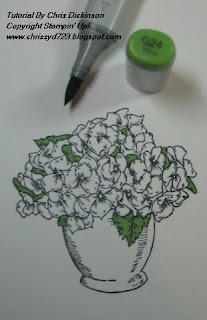
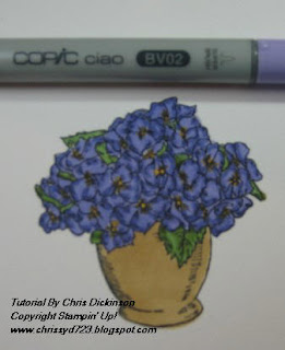
This week, I am using an image from Stampin’ Up! Called Bloomin’ Beautiful. I colored the green areas first with G24 because there are so many flowers in this image, I thought it would be best to color that first so I wouldn’t lose them when I color the flowers. I also colored the center of the flowers with YR23.
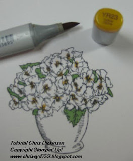
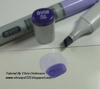
Using BV02 (my lightest color for this image) I colored a base coat on the flowers.
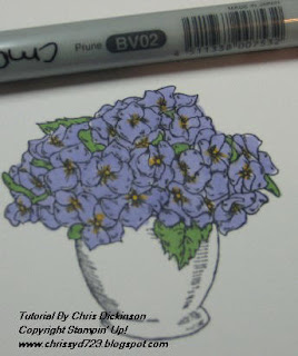
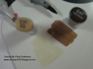
On my color Pallette, I colored BV02 to mix a darker color for shading. Then I used BV08 which is a touch darker than I need for my shading and blended them together with my Colorless Blender.
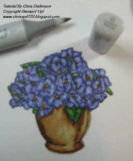
 To shade the leaves, I mixed YG67 and YG99. I then went over the flowers with my lightest color BV02 and the leaves with my G24 to blend the colors.
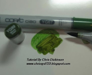
Using my Colorless Blender, I removed some of the color to add a bit more depth of light and shadows to the flowers and leaves.
In the stamped image, you can see where the artist of the stamp put shading lines… Add the darker color to those lines and even to areas you think it may naturally be darker. Next week, I will tell you more about LIGHT SOURCE and shading…
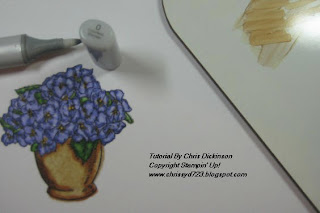
Once again I used the Colorless Blender to remove some of the color, adding a bit more contrast in the shading.
***TIP*** Do you see on my image how the color bleeds a bit over the stamped image line (the right side of the basin of the flowers)? That is due to over saturating the paper with the Colorless Blender. To avoid this, wait a few minutes longer between shading and removing color for the paper and ink to dry. Another way to avoid over saturation is to allow 1/8 of an inch from the image line so when your cardstock gets saturated, the ink will have a bit of room to spread.
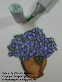
Many people enjoy putting a halo around their image to make it POP out at you. I know varying people using different colors. I used BG10 on this image.
These tutorials take a few hours to do, so I like to know if they are helpful or not! Please let me know if you DO or do not find it helpful!
I will have a completed project for you with this stamp later this weekend!
THANK YOU!

7 comments:
Very helpful. Thanks. Keep em coming, please.
Awesome information Chris!!! Beautiful job!!!!!
Danita
Hi, the tutorials are great. Still waiting for copics to try though. Keep it up, please! I'm gonna need all the help you have :)
Hi Chrissy,
I enjoyed this tutorial as it is the first one to teach how to blend colours to make ones to match the colours we have now! I like the fact that you have shown us two different ways to do it also.
Please keep up your tutorials. Every one that does them covers different techniques. I like yours - I basically know how to colour but not how to make new colours until yours tonight.
Many big thanks.
Chris,
Thanks so much for this great tutorial! I did not know you could use this "tip to tip" method, but now I am ready to try.
Blessings!
Shannon
What a fabulous and helpful tutorial!
Suzy
Very informative!! Thank you :)
Post a Comment